Client: Eduphoria
My Role: Product Design
The Team QA, Project Manager, Front-End Engineer, Back-End Engineer
Duration: 6 weeks
Platform: Web App
Work Methodology BaseCamp
Summary
Eduphoria creates enterprise-level software for educators. Some of their primary users include teachers, curriculum coaches, and admins.
The business need
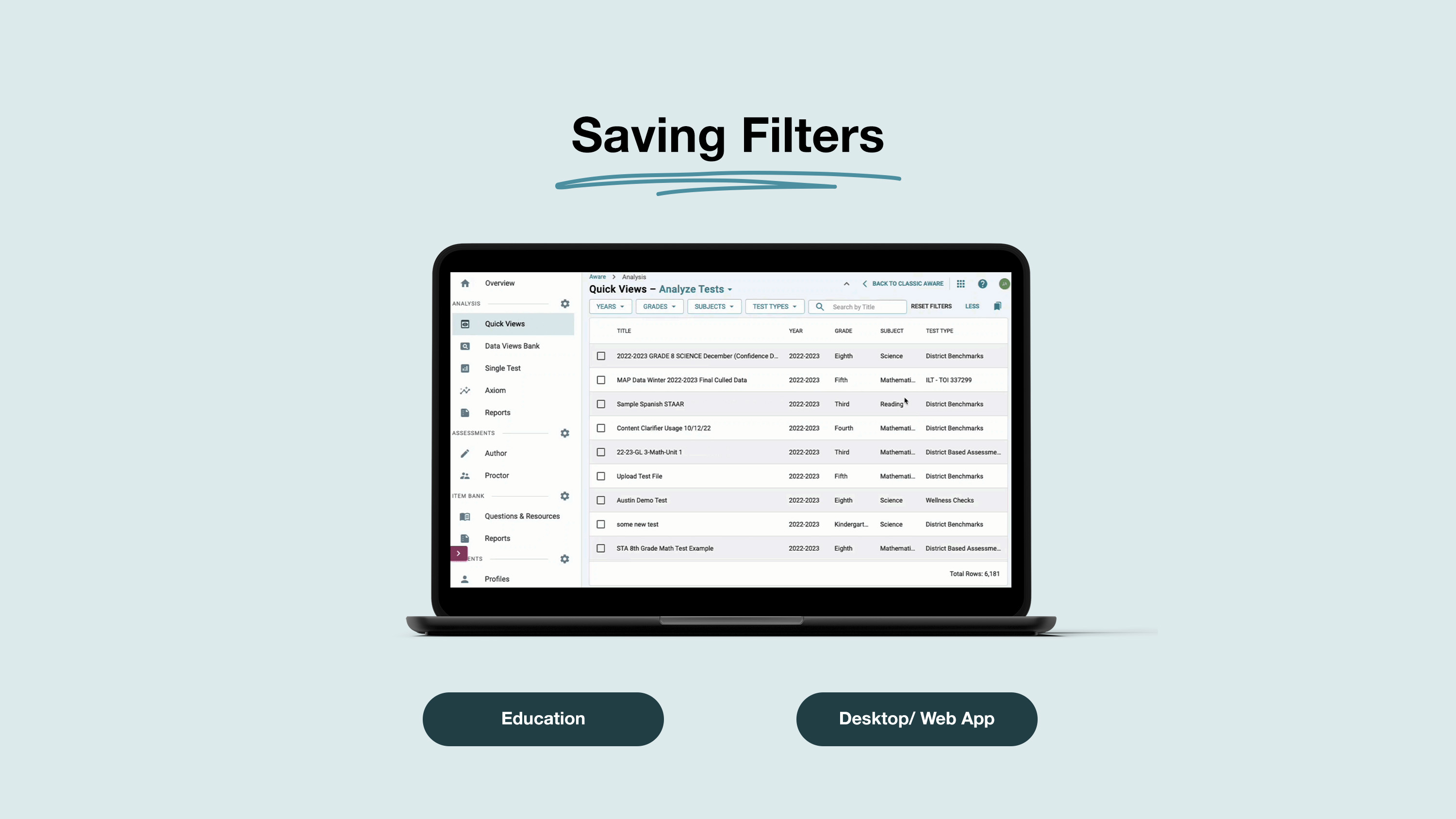
The current interface presents large bits of information in the form of a filterable table. However, there is no way to filter down and store these filtered searches for later. In the case of users who regularly access this information, it can quickly become a time suck.
The solution
We added a feature to the existing interface that allows users to save a set of filters so they can reuse them later. So that they can save time and move on to other important tasks. This saved users an average of 10 -15 clicks per search attempt, thus saving them over 50% of the time they usually took to complete this task.
The Results
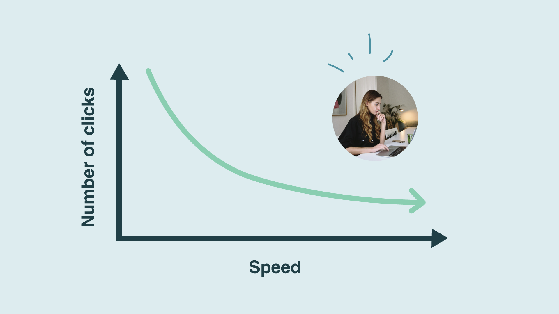
The new saving filters feature reduced the number of clicks by over 50%, thus decreasing the time it took users to complete important tasks.
Background
Eduphoria creates enterprise-level software for educators. Some of their primary users include teachers, curriculum coaches, and admins.
What success looked like
Since users were usually short on time, creating a solution that reduced the number of clicks while eliminating repetitive tasks was important.
How did we discover the problem?
Our users can submit a request for features through a tool we use called Product Board. Based on the amount of requests we receive we can quickly prioritize the important ones to research. After getting this feature request, we set up some user interviews to validate if this was a problem we needed to address.
The process of discovery.
We decided to interview and test a combination of 10 users. We asked them some key questions around their responsibilities as school administrators. And the kind of task they typically prioritize.
I later revisited these users after creating the design solutions so that I could test identical tasks for efficiency and ease of use.
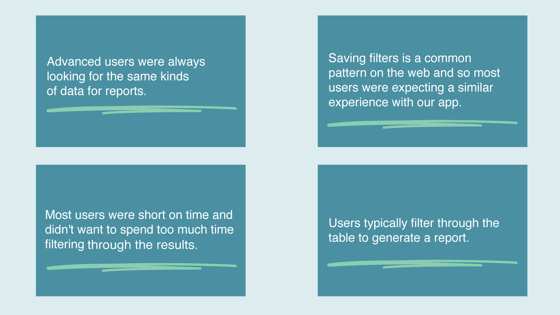
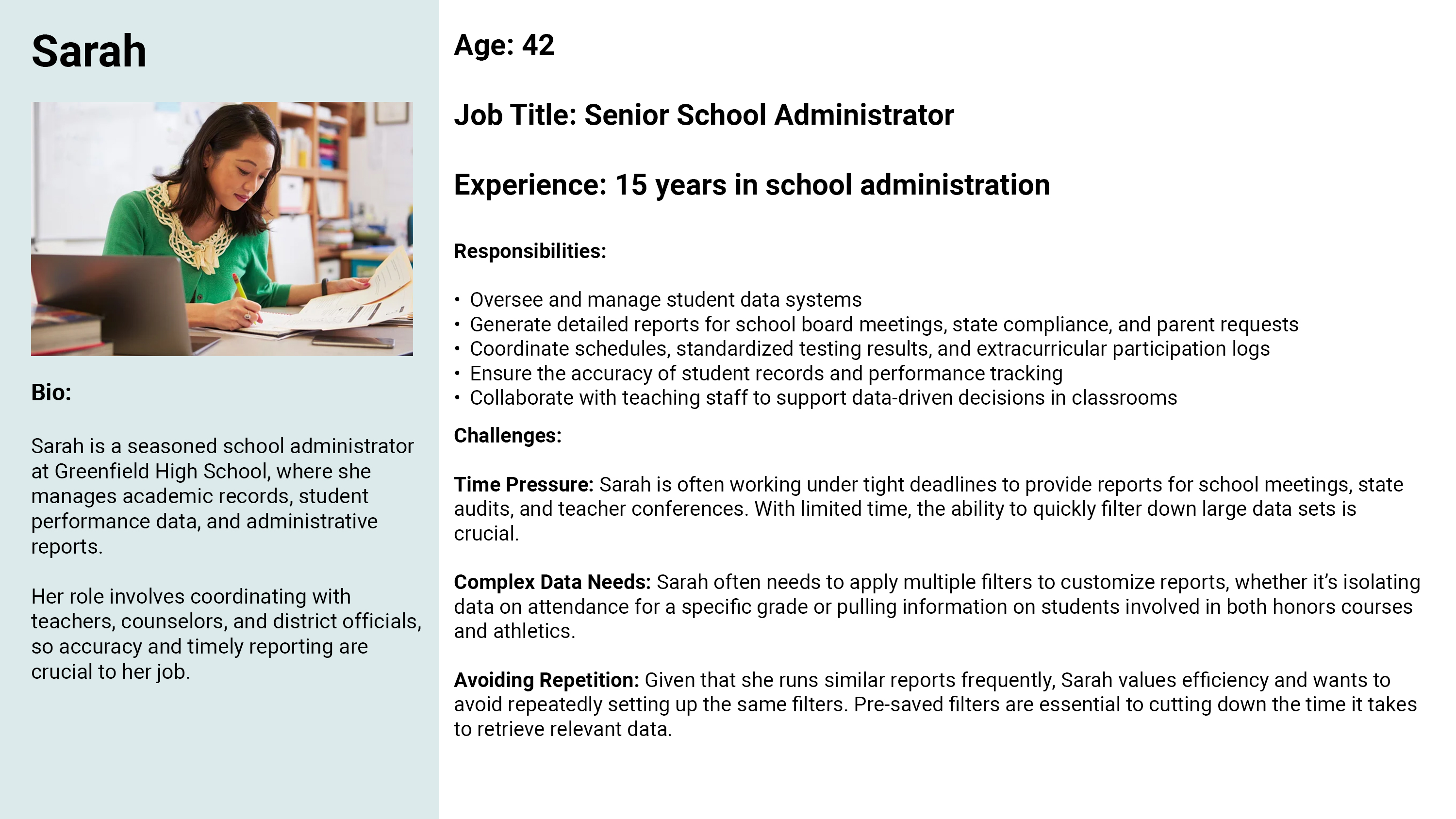
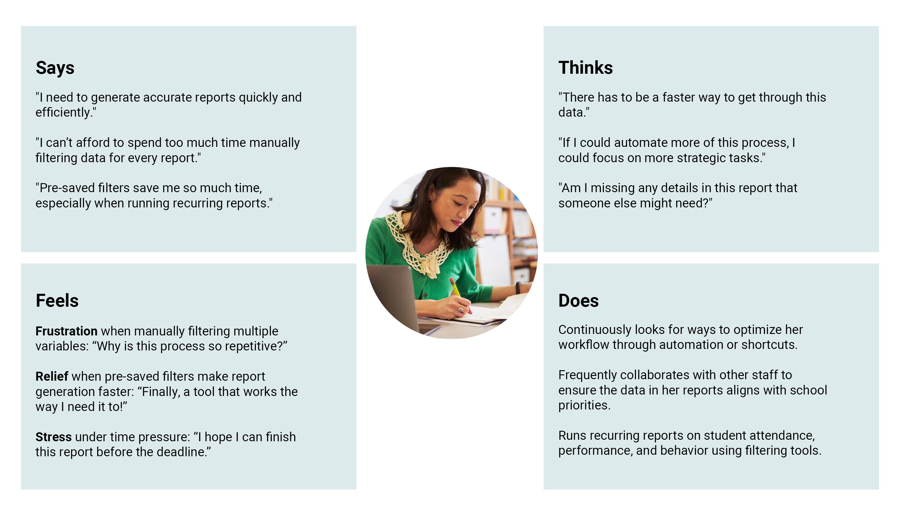
Key Pain Point: Users were frustrated with the manual process of applying many filters to her reports, which eats into her time for other important tasks.
Opportunity for Improvement: Streamlining the workflow further with more advanced automation and intuitive filtering features would significantly reduce stress and improve efficiency.
Emotional Drivers: Users value accuracy and efficiency, but she feels under pressure when manually filtering reports, which makes her feel anxious about missing important data.
Other takeways.
User Persona
Empathy Map
The users current journey
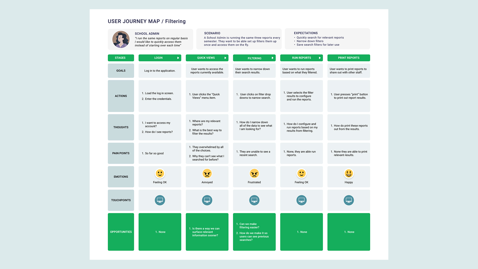
To help myself organize my thoughts I created a journey map to pinpoint where the user's main pain points were based on the interviews we conducted. This allowed me to focus on the places where I could make the most impact.
The current experience
After analyzing the interviews and gathering insights, I wanted to spend some time on where I could make a meaningful impact on the current interface. So I began by stripping it down to a wireframe so that I could do an in-depth assessment of what made sense from a layout perspective.
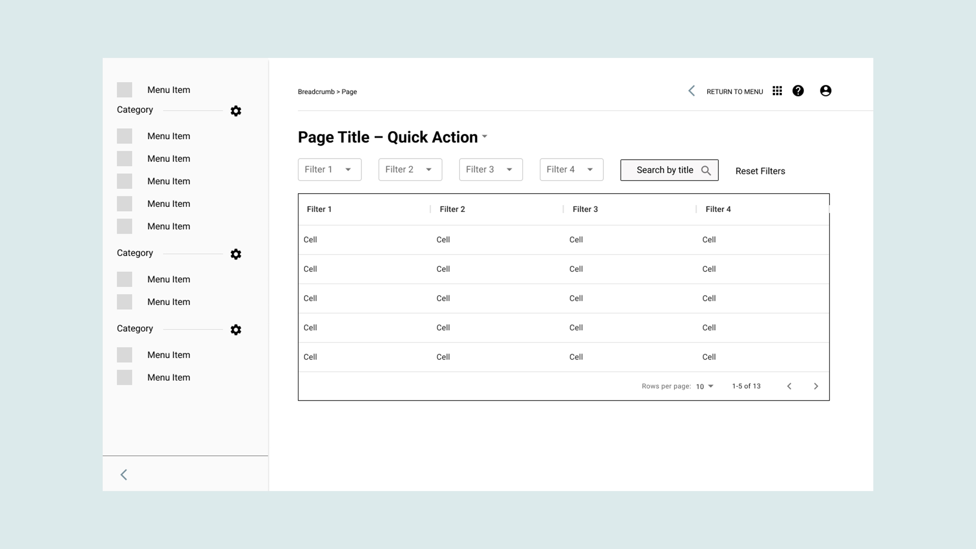
Current wireframe, of interface that users see. They are presented with filterable table and all of the data even information they don't need.
I immediately noticed that users were presented with quite a bit of information so they would need to strike a good balance between ease of use and feature discoverability.
How should users save their search?
So after gathering all of my insights, I began to do some research into some of the best practices for saving filters on the web. I came across a few good ones that used for inspiration.
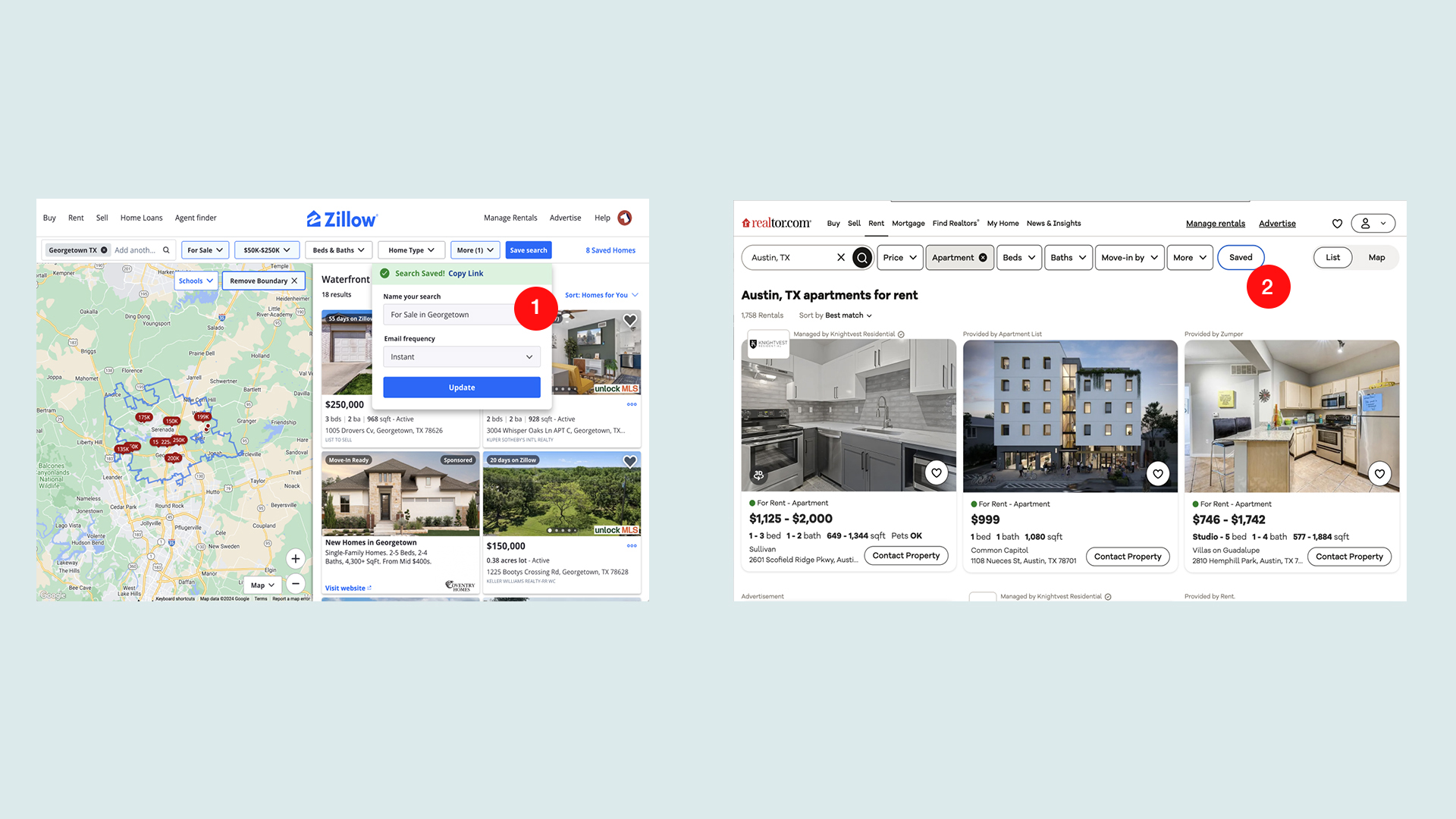
Images of Zillow.com and Realtor.com's web application.
- On Zillow.com users are presented with the option of saving a group of filters and giving that group a name.
- On Realtor.com users have an indication that they saved a set of filters.
My Ideas
After completing my tentative research it was time to dive into some ideation. So I started by creating some wireframes based on the divergent ideas around how we could improve the search and save workflow. These were based on a few of my ideas and some that I got from my previous inspiration.
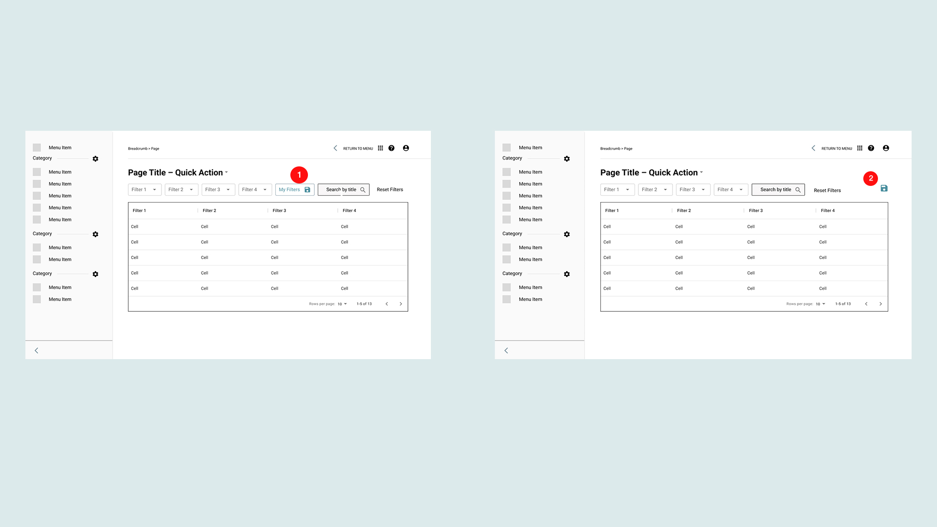
First to early concepts for the saving filters interaction.
Option 1: I decided to place a new filter inside the row of filters. I also experimented with the option of adding a floppy disk icon.
Why Option 1 didn't work: After running this idea by development it would have been a heavier lift, and ran it also ran the risk of pushing out timeline. And a design perspective it didn't resonate as well or stand out enough with users.
Option 2: In this version I tried to place the button outside of rest of the filters. This allowed it to stand out more and didn't require custom built filter.
Why Option 2 didn't work: The floppy disk icon wasn't resonating as well with younger users of the application. This was hurting it's initial discoverability.
Second round of testing and iterations.
After doing some preliminary work, I met with my team and fellow designers to get some feedback. Once I felt good about one of the few options I did some additional user testing to see if there were any potential pitfalls to my designs. And where I could begin to converge my ideas.
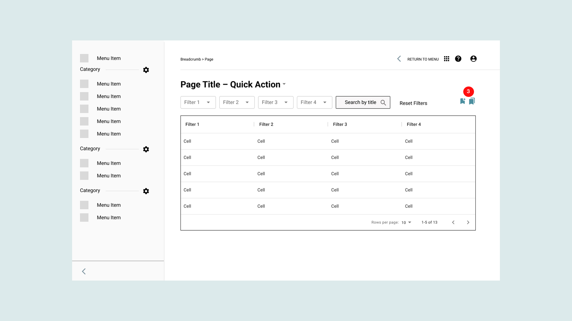
Later interation of the saving filters interface.
How I refined the designs
After gaining some insightful feedback and results from testing, I came up a new version.
Option 3: In this version, I moved away from the floppy disk icon. I substituted it for "bookmark icon". I also introduced the idea of having an action button to start the interaction and a status button to indicate the user had filters saved. (filled vs non-filled icon).
Why Option 3 didn't work: There was a consensus that the two buttons were overcomplicating the interface.
Where I landed
After speaking to a few more design team members and conducting some internal testing I landed on version that ended up shipping with the release.
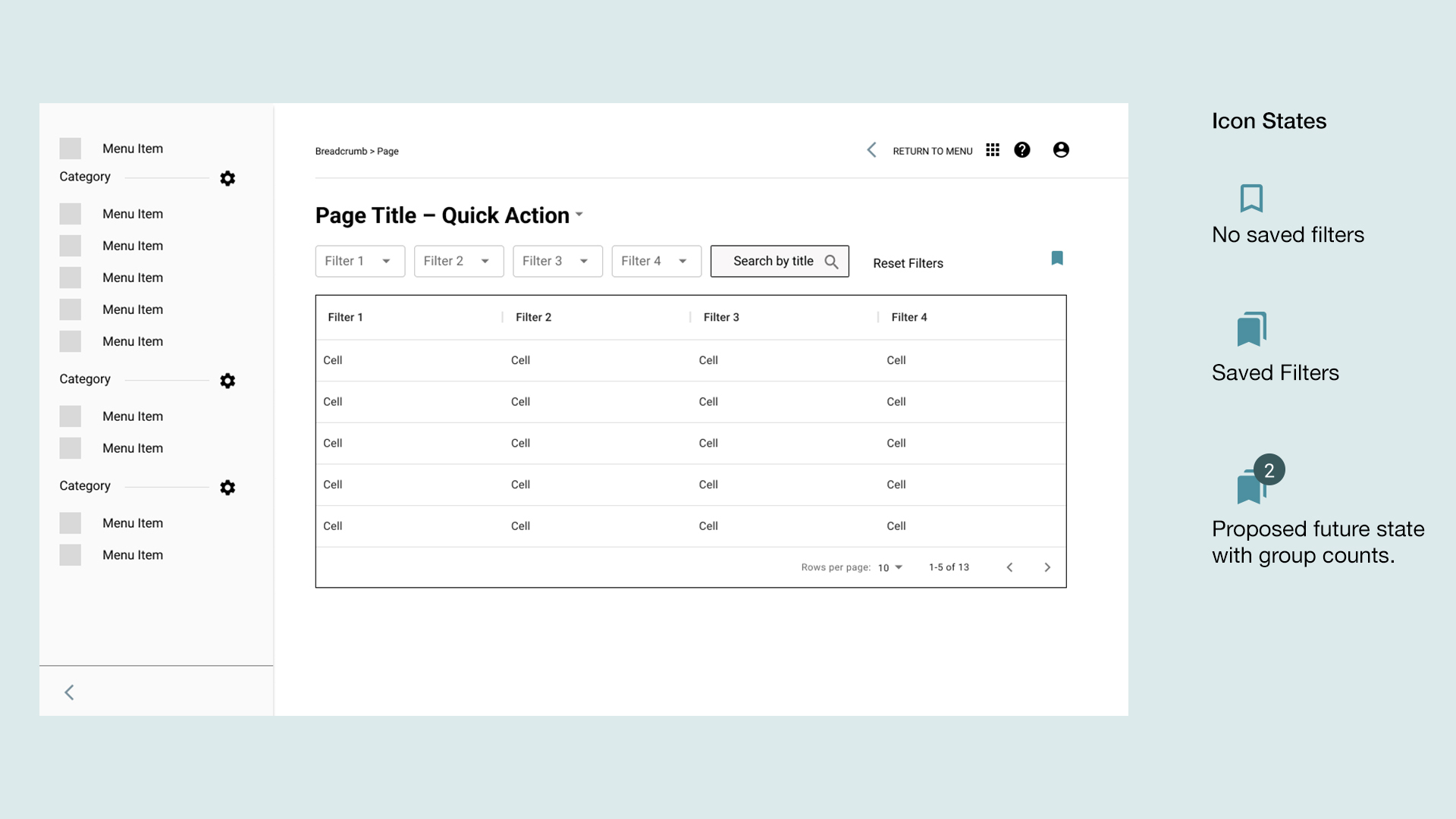
Wireframe of version that ended up shipping with the new release.
So in this version, I narrowed down the interaction to one button. I also introduced two states for the button. An outlined version that indicated no filters had been saved. A filled version, that indicated that the user had at least one set of filters saved. And a proposed group count chip to the filled version. Due to some time constraints, we released without the chip count, but it is a good next step.
The workflows
The workflows
Next, I focused the three necessary workflows. I worked on three main flows. These included: the creation workflow, the accessing saved filters workflow and the favoriting workflow.
Creation workflow

Wireflow for saved filter creation
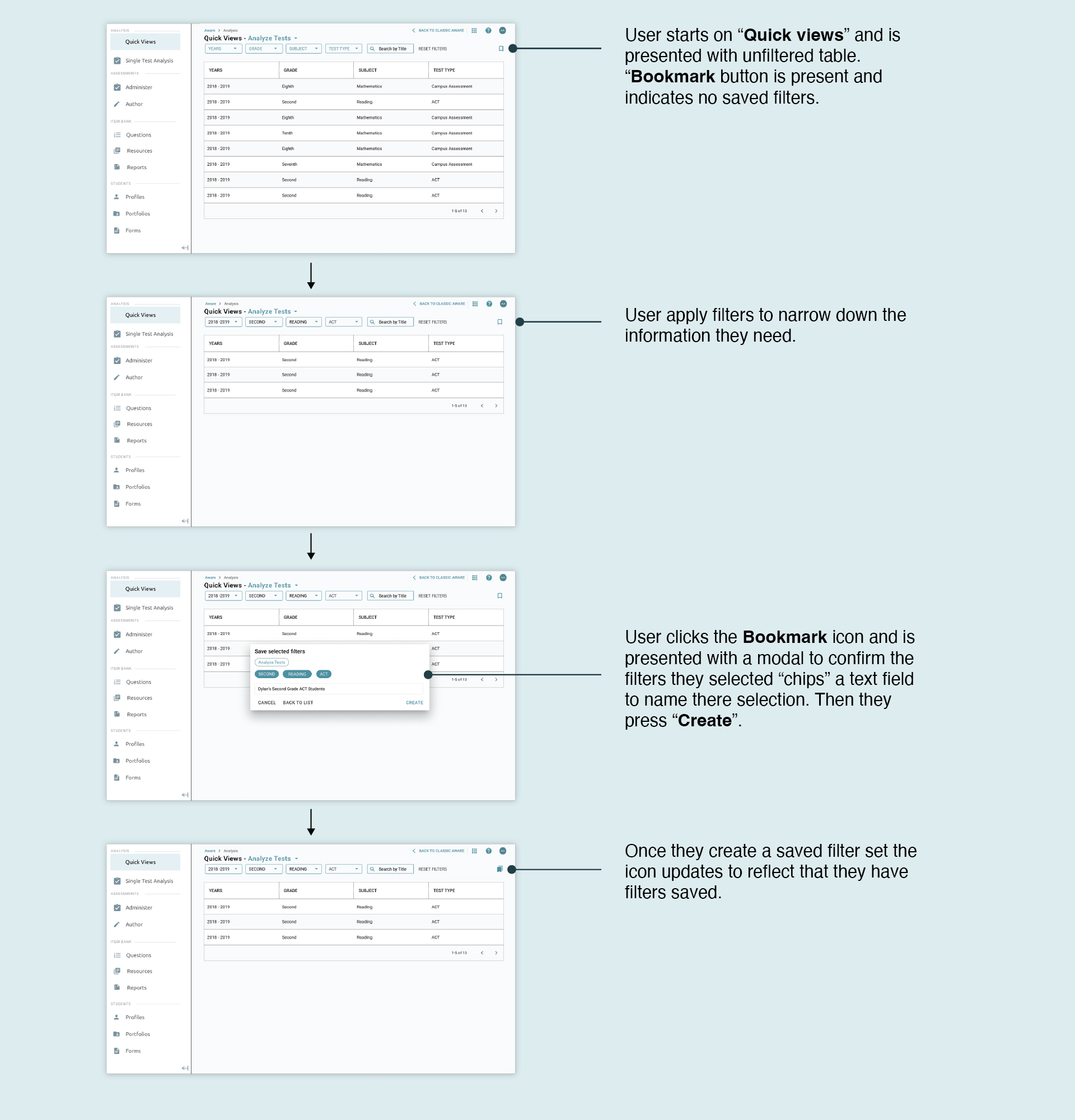
User are able to narrow down their selections then quickly save and name their filters in few clicks.
Accessing saved filters workflow

Wireflow of accessing a saved filter set
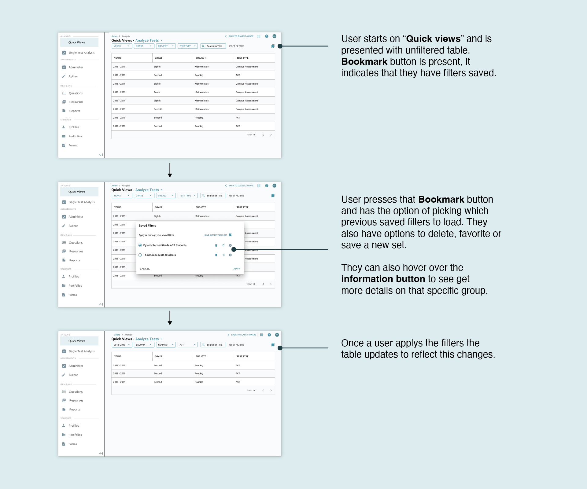
User are able to narrow down their selections then quickly save and name their filters in few clicks.
In a few clicks users can pick a set of filters to quickly load.
Favoriting a saved filter workflow

Wireflow for favoriting a saved filter set.
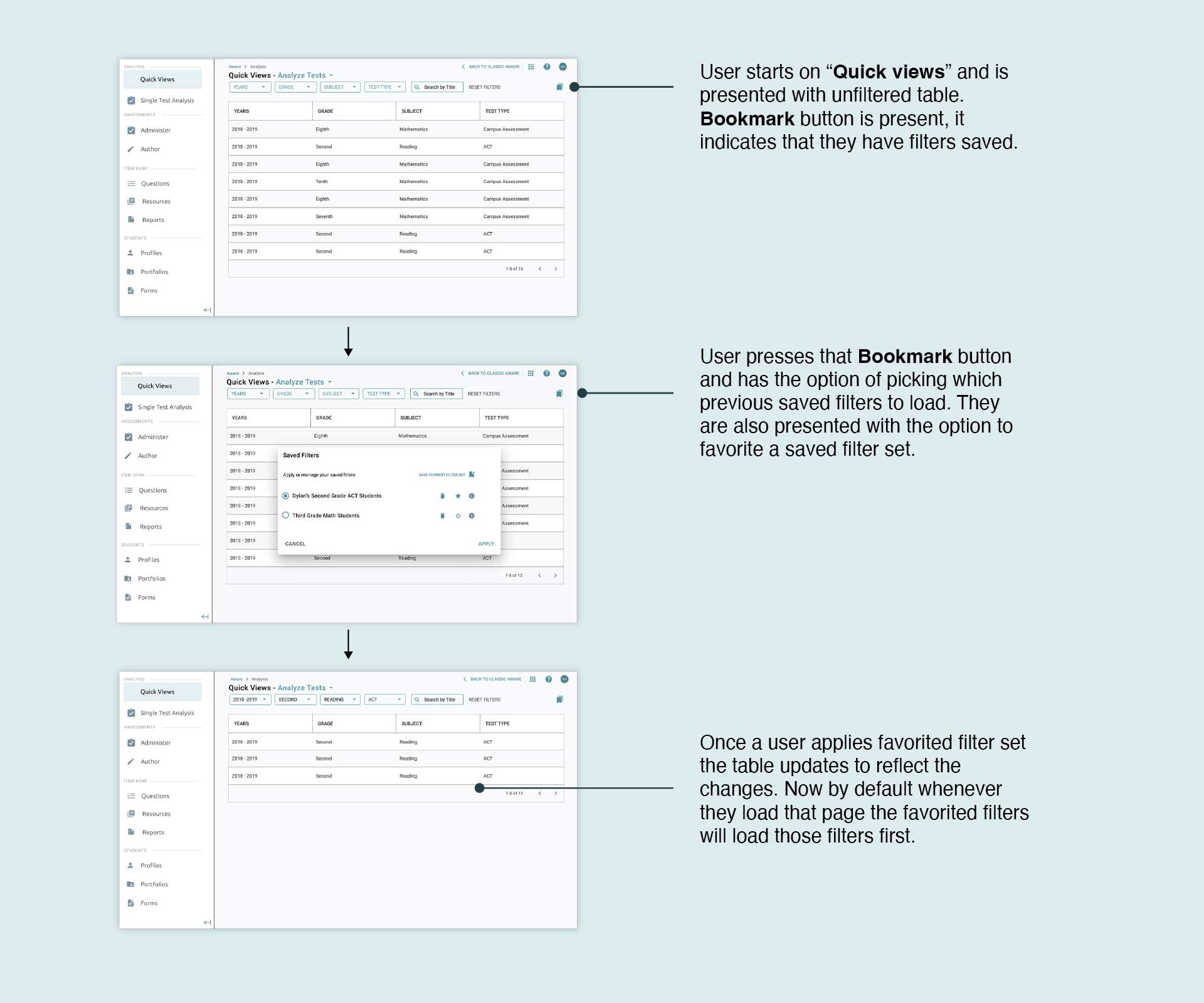
Users can pick from a list of their favorite filters to load by default
What the data told me after testing manual filtering vs filtering with pre-saved filters.
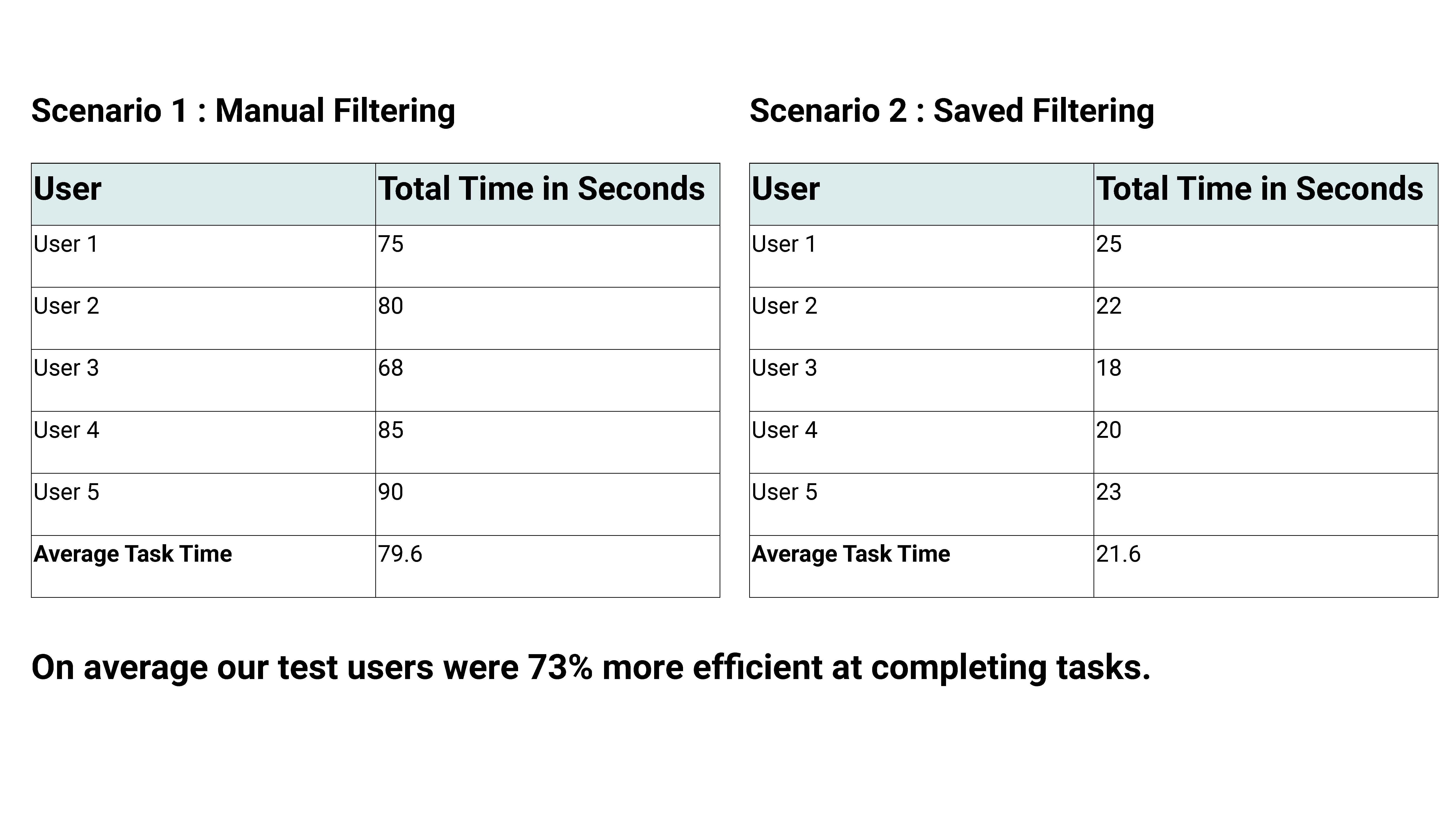
What future success looked like
After completing the redesign of the filter experience, the feature was shipped in the upcoming release. It was well received by our users. Since launch, we have implemented the pattern in other sections of the application, where users typically access and filter large data tables.
Learn more about Saved Filters.
Thanks for reading!


